Case Study : Customizing Your Juno Debit Card with NFTs
This project describes my journey in designing a new feature for Juno’s app. This work was part of my capstone project for 10kdesigners.
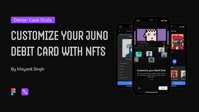
Prototype
Play with the Prototype and discover it yourself:
(I highly recommend opening the Prototype on a desktop or laptop.)
👉Click Here to open the Prototype
Introduction
Juno is a financial technology company that provides a range of financial services, such as mobile banking, including free and low-cost checking and savings accounts, debit cards, bill pay, and direct deposit through its partnership with Evolve Bank and Trust.
What’s the Problem?
Juno found that many users were not using their physical debit cards for online or in-store purchases. As a result, the company came up with the idea of letting customers customize their debit cards with their NFTs (non-fungible tokens) to add excitement and fun to their everyday banking experience and improve their attitude towards using their debit cards.
Getting Started
My Tasks
Design an experience allowing users to connect their crypto wallets and customize their debit cards with NFT. They should also be able to order their customized card to their physical address.
Flows to be designed:
- Entry points — How would you create excitement for this feature and let users start experimenting with the flow
- Card customization experience — this includes connecting wallet and edge case for users who do not own NFTs
- Card spending experience — How would a user now choose the spending method between USD and USDC
- Card ordering experience — How would the user now place the order for this card to their physical address once they are happy with the design
My Design Process
- I started with secondary research to get vital information to drive my initial research.
- Gathering insights from the research to understand the problem space.
- Understanding the psyche of the user through Primary Research.
- Creating a Userflow.
- Browsing through Inspirations.
- Making Lo-Fi wireframes using Figma.
- Designing & Iterating Visual Screens.
- Finally, documenting the whole Case study.
Research
Market Research
Goal: Understanding how the current problem is being solved in the market and the possibilities for improvement.
- The only competitor I found was HI, who, in partnership with MasterCard, recently announced they would offer customized Debit Cards with NFTs artwork.
- Additionally, I looked at other personalization practices being used in the market other than NFT artwork. Many renowned companies offered this feature to create a sense of personalization and excitement among users.
- An independent report by Aite Group indicates that in 2018, card activations increased by 6% at financial institutions that provide card artwork. The custom card product also increased customer retention by 18% and transaction volume by 21% compared to generic cards.
Primary Research
Goal: Understanding the concept of NFTs among users and what they are likely to feel and do about this feature. I interviewed four people who belonged to crypto and observed a few things during my conversation.
- Click to See Interview Question
Insights from Interview
- Users are concerned about the ownership of NFTs and what will happen if they sell them.
- It was a great way to flaunt their NFTs and show which community they belonged to in real life.
- One user suggested personalizing their cards with stickers if they don’t have NFTs. This could potentially drive growth for the company by encouraging the use of physical debit cards.
- As true digital natives, they are closely connected to online communities. Consequently, they seek out exceptional, unique experiences that enable them to express themselves, and card customization could be one such example.
Overall, the interviewees responded positively to the idea of NFTs and were excited about the opportunity to personalize their debit cards.
UserFlow
The customize card option was related to a debit card, so I took into account the current flow and placed this feature under the card section in the app.
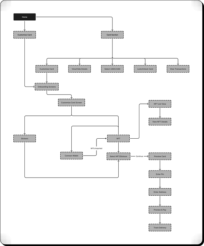
- Additionally, I added a small card to the Home Page to let users know about this Card Customization feature.
Design Phase
Before starting the wireframing process, I took some time to browse through various design inspirations and sketches. This helped me brainstorm ideas and features for my wireframes. Taking inspiration from other designs also made it easier for me to create my wireframes.
This is a sneak-peak of the wireframes and iterations I did before making visual designs.
Iterate, Iterate & Just Iterate

Want to take a peek at my design file and see how I keep my work all organized👇:
Visual Design
This section will discuss my thought process and the reasoning behind my design decisions. I also chose to design the feature in the dark mode because it gives the design a more premium look.
TypeFace
I selected Space Grotesk for its modern, minimalistic aesthetic and its ability to convey simplicity. As a secondary font, I chose Inter for its legibility in smaller sizes. Both of these fonts work well together and support the overall goals of the design.
Color
I selected Blueberry (407BFF) for all primary call-to-action buttons and transformed the entire app into dark mode to achieve a sleek and modern appearance.
Card Design
Before going directly into visuals, here is a preview of the credit card designs I came after many iterations for card customization features to make the card more usable and attractive.

Home
The user interaction with the card customization feature starts on the homepage. Therefore, I placed a card in the “Do more with Juno” section on the homepage to highlight the card customization feature.
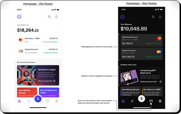
- I also improved the homepage by redesigning the checking account and crypto account card sections.
- Users can also access the card customization feature by going through the card section in the app navigation menu.
Card Section
This screen was already present in the app, so I redesigned it according to the new requirements.

- Added a Balance section below the debit card and its balance breakdown to see the balance of each card separately.
- View Details, Customize, and More Options are related to virtual cards, so grouped them together in horizontal buttons.
- Card Spends and Card Lock are features related to physical card use, so I grouped them into toggle buttons.
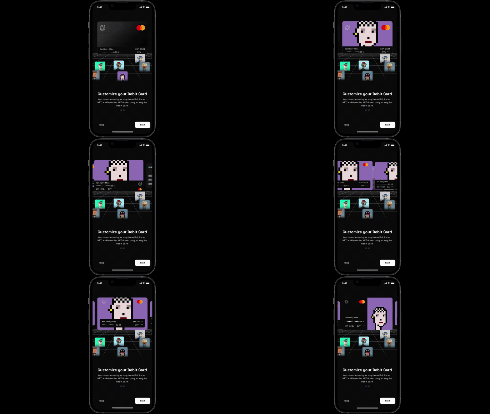
Onboarding
Assuming the new design is implemented and shipped to users, how will this feature onboard them:

- The screen on the left lacked excitement, so I improved them based on feedback to make this feature a little more enjoyable.
- I also tried a little animation with Figma’s smart animate.
Select Card
After the onboarding screen, users are immediately prompted to select a card to customize.

I explained the purpose of connecting the wallet on the NFT section to the user and also to get the user to the customization screen quickly like this:↓

Connecting the wallet

- In order to assist users during the process of connecting crypto wallets, I have included text explanations to provide clarity and understanding.
Debit Card NFT / Sticker Customization
Finally, the moment I’ve all been waiting for: the NFT/Sticker customization screen!
The user has two options to customize their debit card: using non-fungible tokens imported from his crypto wallet or default stickers provided within the app.
- Using NFT

Users can drag the small button on the customization screen to view all the imported NFTs in the grid view or the list view option on a new page. By clicking on a specific NFT, users can also access the NFT Details Page, where they can view detailed information about the NFT, such as its attributes, creator, and network.

2. Using Sticker

Preview and Pin
Once the user has successfully customized their card, they can preview the front and back of the card and choose to proceed to the next step, which involves verifying their identity by entering the PIN of the debit card.

Address
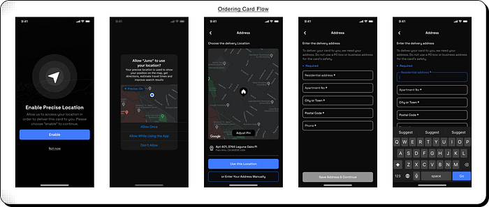
After that, he can enter his address. In this case, I provided two options to the user for providing their address: they can choose the address detected by GPS or manually enter their address if GPS does not correctly detect it.
Payment & Tracking
The payment and tracking section reviews all the details the user has provided; he can edit any details here if needed.
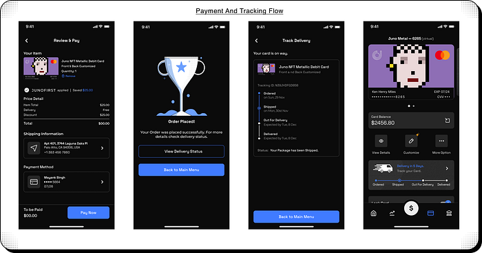
- I also added a card on the Debit Card Section of the App to display the delivery status of the Debit Card. Users can click on it to access the Track Delivery page.
Mistakes & Learnings
- My first mistake was not doing enough iterations on the wireframes, which led to major changes in the high-fidelity designs.
- I learned the importance of micro-interactions and how they can make a design more engaging and interactive.
- I also learned how to animate in different styles within Figma, which improved my overall design skills.
- Overall, this case study taught me the value of thorough planning and iteration in the design process.
